
A WALK IN MY LIBRARY:
DECEMBER 31, 2020
JASON BUTLER'S EXHIBITION
Meyer Schapiro, “Theory and Philosophy of Art: Style, Artist and Society

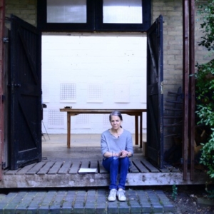
BEHIND THE SCENES:
LIOR GALL, BRUSSELS, 2020
HIGHLIGHT:
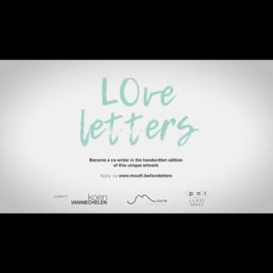
LOVE LETTERS
A new participative project by artist Koen Vanmechelen

BEHIND THE SCENES:
LINDA KARSHAN AND THE BROOKLYN RAIL

BEHIND THE SCENES:
NOVEMBER 2020, LINDA KARSHAN
The Covid Conversation, A New Film
A WALK IN MY LIBRARY:
PARIS, NOV. 6, 2020
ABËTËI by Ishmael Fiifi Annobil

BEHIND THE SCENES:
MATHILDE BRETILLOT
Designs new offices for Parfums de Marly, Paris

BEHIND THE SCENES:
BERLIN STUDIO VISIT - LUKAS HOFFMANN

BEHIND THE SCENES:
BERLIN

BEHIND THE SCENES:
GALERIE NÄCHST ST. STEPHAN ROSEMARIE SCHWARZWÄLDER, VIENNA
Friederike Mayröcker, Curator Hans Ulrich Obrist - until 10 Oct
Schutzgeister/Guardian Spirits
BEHIND THE SCENES:
JSVCPROJECTS AND KOEN VANMECHELEN
The Battery Channel Podcast
BEHIND THE SCENES:
ARTISTS IN THE STUDIO, JERSEY
BEHIND THE SCENES:
MANIFEST OF THE TRUE

A WALK IN MY LIBRARY:
3 LOVE POEMS IN THE SUMMER

BEHIND THE SCENES:
SUMMER NEWS

BEHIND THE SCENES:
ROD MENGHAM,
Awarded the Cholmondeley Award for Poets

BEHIND THE SCENES:
JILL SILVERMAN VAN COENEGRACHTS RECOMMENDS

BEHIND THE SCENES:
LINDA KARSHAN
Studio visit

BEHIND THE SCENES:
STEFANO CIGADA,
"Frammenti" at the Museo di Roma in Trastevere

HAPPY NEW YEAR 2020!
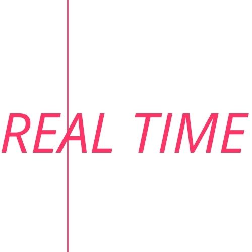
BEHIND THE SCENES:
THE LAUNCH OF REAL TIME AND THE 3BS
June 4th 2021
PART I
This is the tale of a unique visionary website team and our launch today of a new feature. REAL TIME features evolving posts from JSVCprojects weekly social media platform now live on our site highlighting what our artists, designers and galleries are doing or sometimes just what we are seeing, reading or thinking.
Shout out our 3B’s – BRAINY BOYS IN BERLIN – who have worked months to make the website function elegantly retaining our still rebellious nature. Their edginess is key in navigating the art life. Designer Jochen Mahlke of mahlke.one and Richard Lem mrhide.de have made this process exciting every day.
It began as iconic work with Jochen seven years ago; since then, we have collaborated together on two incredible books, our website, and a bespoke typeface. Richard is the webmaster of your dreams. We are not finished.
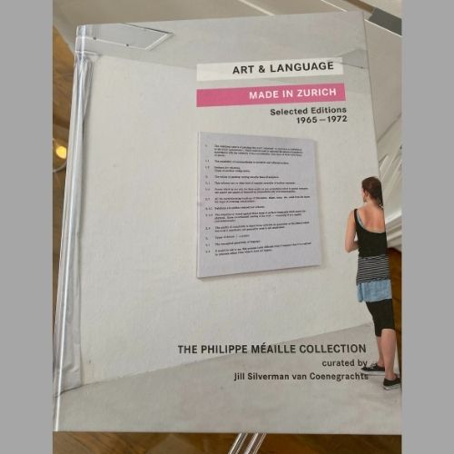
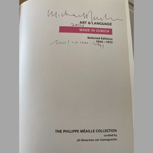
In 2014, Jochen designed a hard cover book about the earliest certificate works of ART & LANGUAGE. MADE IN ZURICH, SELECTED EDITIONS 1965-1972 from The Philippe Méaille Collection. Not an easy job. These great artists Mel Ramsden and Michael Baldwin are still, even now, under the radar; I like to say they are very much the Rolling Stones of Conceptual art. The certificate paintings in this book are the DNA of their dialectical practice that spans now over half a century. The challenge for any graphic designer is text-based work, its type from the old manual typewriters of the 60’s starred on certificates. These are blown up into large paintings. The exercise of creating a typography for a book became at once abstract and specific. How to discern a template around art that is type? Texts, images, interviews, analysis in three languages English/French/German to accompany a traveling gallery exhibition. How can the book clarify a position that the certificates represent? Making the painting is the action of making a blow up. It is collaborative. Instruction drawings made as editions.
PART II
The book, a collaboration with The Philippe Méaille Collection, I curated the exhibitions and edited this book in collaboration with Galerie Bernard Jordan, Paris, Zurich, in Berlin with Emilie Seydoux as Galerie Jordan/Seydoux — they ran from 2014-15. Mahlke chose black, white and pink as the palette for this.
We had a conversation early on about radical practice. Growing up in the DDR, he had a strong intuition about the use of typology in early 20th political communication. He had books of typography from the DDR, which we looked at in his Berlin kitchen the summer of 2014. In the case of the early manifesto- like works of ART & LANGUAGE the voice was in the third person, like Biblical writing, or political propaganda. It was vital not to interfere with their energy. So the book was black and white with high-resolution images of pieces of paper that had enormous texture. “We must see the edges, warts and all,” I said to him. The documentation is the first iteration of these ideas and the artists were in their 20’s, it was a rock and roll time.

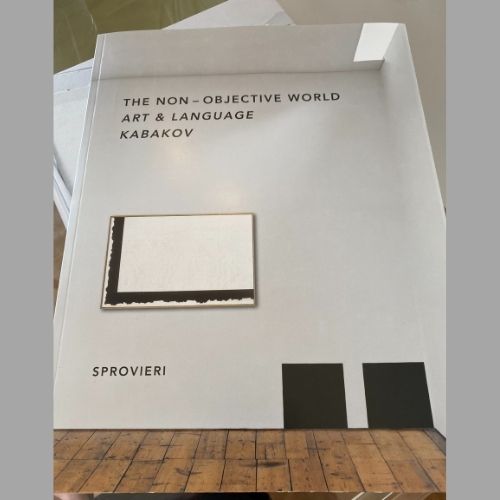
Pink screens lay over large double page spreads to shift the viewer out of documents and texts. The French and German translations on colored papers. A handsome, bright, studied visual structure for the works on display. The second book in 2016 was again ART & LANGUAGE but with KABAKOV for SPROVIERI London, THE NON OBJECTIVE WORLD. Another deep-dive into early modernism; the evolution and influence of Malevich on two of the most important artists of our current period, both of whom discovered the famous writings of the founder of Suprematism in the 1960’s. The exhibition juxtaposed the impact of the Black Square on both practices.
PART III
The book moved into the color of black, the vivid aspect of documents and writings with a spare typeface that provided a warm envelope around this discursive historical landscape that swept the reader or the exhibition visitor from the early 20th century straight through the century of evolution in understanding Malevich and his dialectical position in the reading of abstraction. It accompanied the exhibition both in Basel at the Fair in 2016 and that fall in London at SPROVIERI on Heddon Street in London.
On the subject of the Black Square, I will share with you the important realization the book highlights, which is something Ilya Kabakov said to me many years ago in his studio, we were going through watercolors in preparation for the exhibition “A Return to Painting”; we were talking about minimalism and the difference between European and American minimalism and the understanding or misunderstanding of the Black Square. He explained to me that in 1915-6 during this pre-Revolutionary moment, Malevich knew anyone walking in to see the 0.10 exhibition would see the Black Square up in the corner where the Icon of the Madonna would normally hang. So there was content in the square it was a language that everyone understood an overlay of image on image. Redolent with vibrations. The opposite of American minimal painting that was stripping content out of the picture plane for the purposes of reductive emptiness.
It was this confidence and maybe over zealous romantic heroism in the position of Malevich which ART & LANGUAGE took to task in the late 1960’s in their drawings, installations and texts on the Black Square, also included in the book.For the inside back cover, we made a family portrait you will see.
PART IV
In 2018, the discussion of a website slowly began. Jochen knew very well the maniacal way I obsessed over content, railing at him about the preponderance of bling-bling. We met on the intersection of polemics and clarity. When I told him I would only make a website without images because I felt there were too many in the art world, and on social media. He did not try to talk me out of this. I think he realized trying to talk me out of anything was a lost cause. But he thought about this and found a way to let us say what we needed to say. That we were different, that we were unapologetic in being so. If people need images let them see the person and then discover the project. Click on the links and see what everyone is doing. Take time to think for a moment. Breathe and think.

Right: Ilya Kabakov, “Ilya Kabakov: With Respect to my Teacher Charles Rosenthal, 1972”, 2008, oil on canvas, 102×152.5cm
In the meantime, he listened as we discussed everything from the name of the agency, how to refer to myself, and all the growing pains of trying to find a small chink in the armour of an apparently monolithic industry to allow in a little light, time and breath for another kind of awareness. Another voice. He designed and brought in Richard Lem (mrhide.com) the warm comic genius programmer to work with us on the website; we developed the site one chapter at a time, the typeface was new, the structure was new, it all began to work slowly. The moving red line an artwork of Esther Shalev-Gerz. The 3Bs loved it. I never paid much attention to social media, but when I was locked up in London a year ago, I started with my assistant Hélène I. posting long digressions on Instagram and was delighted by the idea that they could then be dropped into Facebook and eventually LinkedIn. We have been on a weekly basis trying to open up our strategic agency bringing you into the fray, the experience of a creative life in its various shades.
PART V
Last year, Richard Lem smiled when I added in our weekly Zoom that I wondered whether it would be possible to take the social media posts and have them appear on the website. “We can call it REAL TIME”. He laughed and rolled a cigarette. “I think we can do it”. Jochen, also on the Zoom, nodded. Months and months later, we have REAL TIME so if life is busy and you forget to check on Instagram what we are doing, you can catch up on a big screen and see the photographs, read the long winding conversations and thoughtful analysis of what we have cooking here. I like to imagine that JSVCprojects is just a big kitchen and we are looking at the ingredients in our collaborators studios and galleries and wondering what can we possibly cook up next. Mrhide is phenomenal and has made it possible to track all these goings on in different parts of the world for you. If you miss a week or two don’t worry, we are archiving. I think that he and Jochen and Hélène I., my assistant, thought I was kidding when I wanted to make a post to launch REAL TIME. Small accomplishments after this past year seem even more vivid. I am grateful and happy to work with such creative thinkers, and willing partners in crime. Hélène with her “hacky” intelligence figured out a surprising way to insert my long digressions into to rather inflexible formatting of Instagram. It was Richard who coined the phrase, hacky, and now I look for as many ways as I can to be just that way. Bend the edges, walk over the line with one foot if possible. Stray just a little and think about the impossible that you can do in a myriad of ways.
